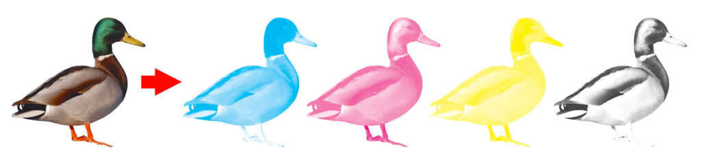
Spot colors are pre-mixed inks that can be used instead of (or in addition to) blending layers of CMYK ink with a halftone pattern. There are several reasons to print with a spot color: it can be less expensive, it’s more consistent, and it’s unique.

Economy
Not every job is ideally suited for a 4-color press. Even though you can convert spot colors to combinations of CMYK (cyan, magenta, yellow, and black—collectively referred to as “process color”), printing everything as 4-color could be unnecessarily expensive, or require too many steps. You might have an envelope with a 2-color logo and a return address. Using half the plates on a smaller press means a less expensive print job, and you can print on ready-made envelopes. Or you might have custom 2-color letterhead you want to run on paper that’s already trimmed to size.
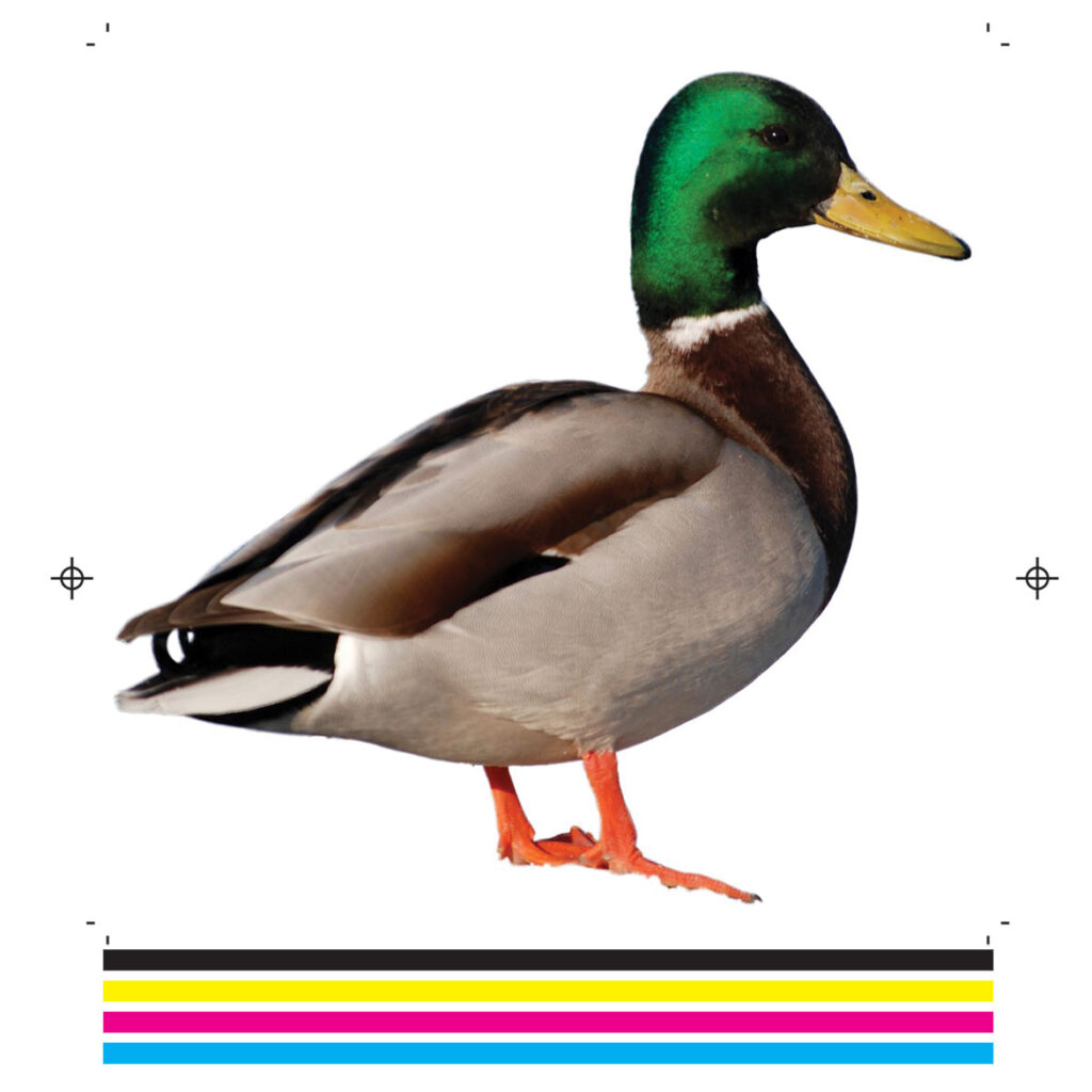
When a 4-color job is arranged on a press, it requires space around the artwork for registration marks and color bars. This lets the operator line up each plate precisely and measure each plate output individually. But it requires printing on larger paper and trimming down to size. Sometimes this isn’t always economical. For full color envelopes, you need to print flat sheets and convert (i.e. die cut, fold, & glue into envelopes), and this isn’t an economical way to print envelopes unless you need a few thousand or more. But pre-made envelopes don’t have any extra space on them for color bars or registration marks, which means it’s going to be very difficult for a press operator to register 4 plates perfectly. Registering two colors with the artwork alone (no color bars or registration marks) is easier, and logos where colors don’t meet or overlap is better still.
If you pick up an old children’s book (Dr. Seuss is a classic example), you might notice most of the illustrations are predominantly one color with a splash of one or two highlight colors. This is done to minimize ink use and registration issues. A print job that consists of solid colors or basic screens is usually easier and faster to print than one with a lot of complex blending and shading.

However, it’s important to note that printing in spot color is only less expensive if you print in spot color only. Adding spot colors to a job that’s already full color creates extra color separations. Some presses are set up for 4, 5, 6, or 8 colors so it might be possible to add a couple of spot colors without creating a complete second pass through the press, but it also depends on the size and specs of your job. Check with your printer about their capability before mixing spot colors and CMYK artwork—most of the time, it’s more economical to convert spot colors to process (CMYK) before printing a job that requires both.
Consistency
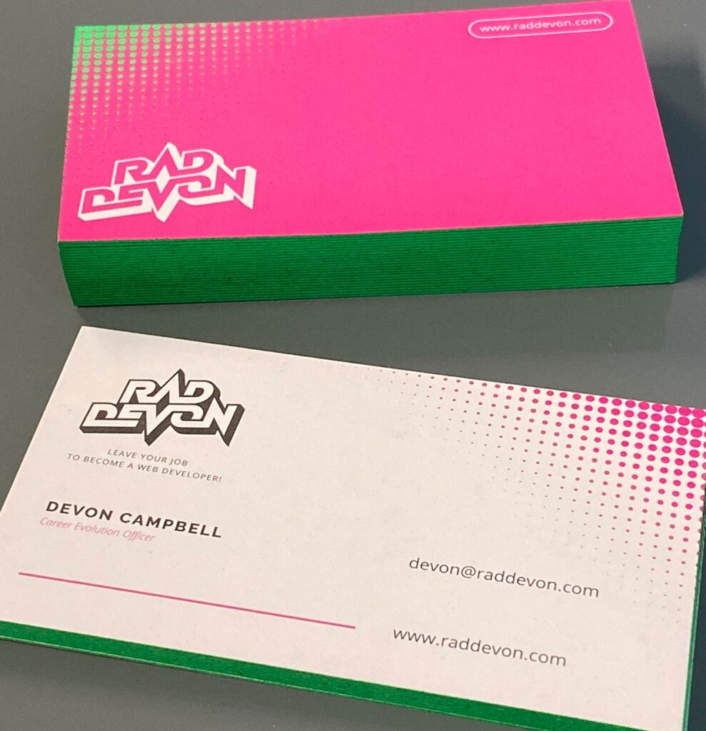
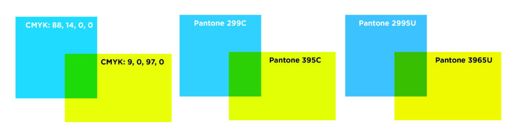
Spot colors are common in logos and brand identities because they’re consistent. Say you have a logo with a bright green-yellow. If it’s built with Pantone 395, your printer can look up 395 in a Pantone swatch book, ink a press with a can of 395 ink, and print your logo exactly the way it’s intended to be printed. Every time.
On the other hand, if your file is built with a CMYK blend (9% cyan & 97% yellow, for example), there are too many variables to guarantee that your color will look the same from one printer as it did from another. Linearization*, ink density**, even ambient lighting all contribute to a margin of error in printing CMYK builds. There’s no pre-printed swatch that tells the press operator exactly how 9/0/97/0 CMYK should look. It takes less than a percentage of difference to look noticeably “off”—one day’s 9/0/97/0 might look greener than the previous day’s. In that case, the press operator can adjust their press to match the previous day’s output, but there’s no definitive source that says which day’s color was absolutely “correct”.
*Linearization=the process that converts artwork to a halftone screen for printing
**Ink Density=how heavily the ink flows on the roller; this needs to be adjusted for the stock and artwork, and environmental factors like temperature or humidity
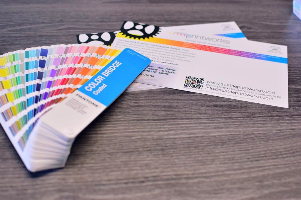
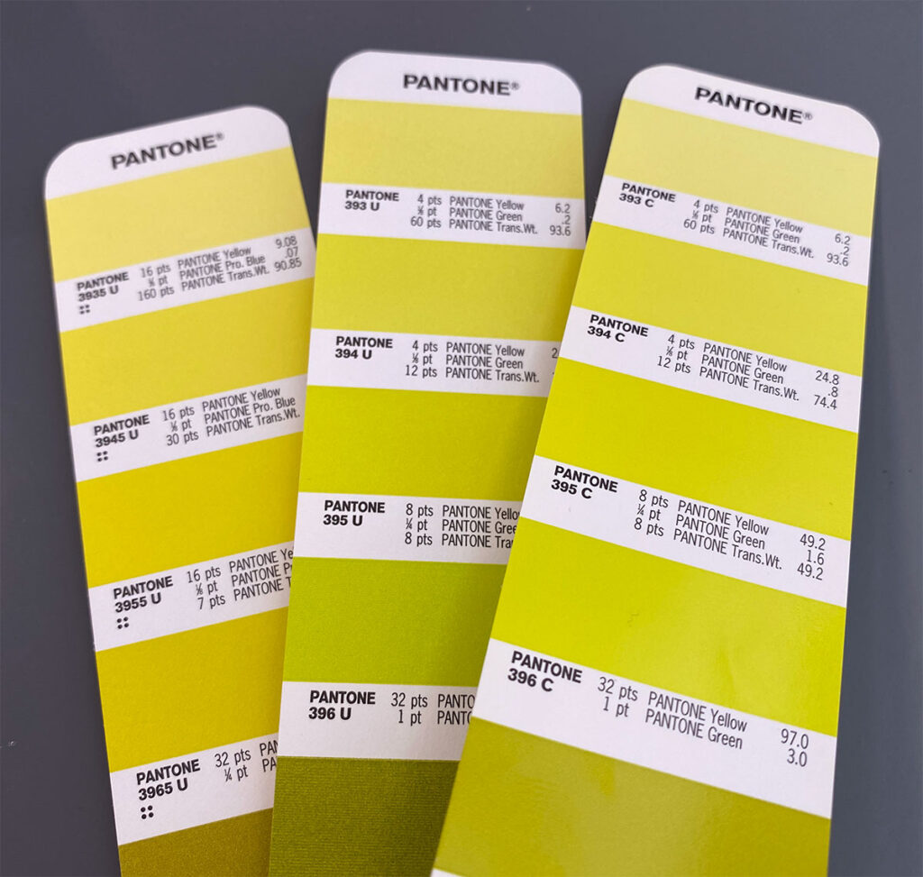
Pantone has established themselves as an industry standard for spot color. They’re not an ink manufacturer (although it originally grew out of a small printing company); their primary product is the Pantone Matching System: a color space comprising 2,000+ colors. Similar to paint chips, Pantone formula guides show how to mix each color using precise ratios of roughly a dozen base inks, and the physical swatches provide a standard for comparison. The printing of these guides is carefully controlled for accuracy: this insures that the particular shade of yellow that your printer sees in their Pantone swatch book is the exact same yellow your graphic designer sees in theirs.
This consistency is important. If it weren’t for an industry-wide standard, printers would all mix their own ink a little differently, and it would be like ordering a Caesar salad from a restaurant—everyone agrees on the same basic ingredients, but everyone makes it a little differently (and claims theirs is better than anyone else’s!) That’s not the case with Pantone spot colors. If one printer mixes Pantone 395, it should look exactly like Pantone 395 from any other printer.
Unique colors
Many Pantone spot colors can’t be accurately reproduced in a CMYK color space. This helps brands stand out, and gives them a unique identity.
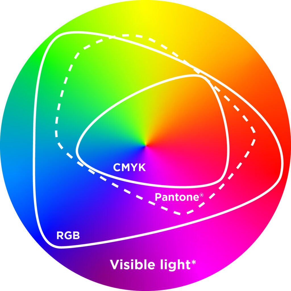
*The complete circle of visible light here is a simulation: even though everything outside of the “RGB” gamut is supposed to represent colors you can see with your naked eye that can’t be reproduced on an RGB device, you are most likely viewing this on a computer, smartphone, or tablet screen, which are RGB devices—so the actual color your eye sees in this graphic is already limited to an RGB color space.
Spot colors can also be metallic or fluorescent, and add a hint of color unachievable with offset or digital CMYK.
How to incorporate spot colors in a digital file.
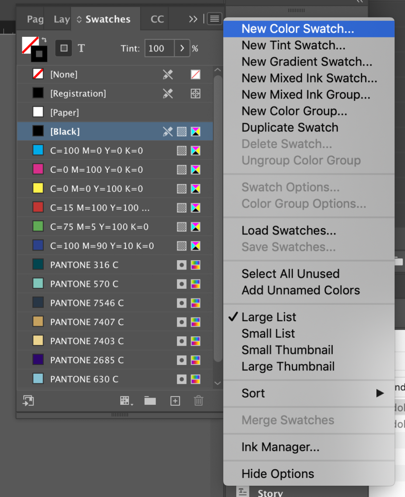
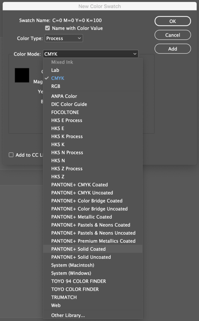
Using Adobe InDesign, simply add a spot color to your Swatches menu by selecting “New Color Swatch.” Selecting “Process” from the Color Type dropdown menu will allow you to use a spot color in a layout but will convert it to CMYK process color for final output. Selecting “Spot” as the Color Type will isolate your spot color onto a different separation/plate for printing.
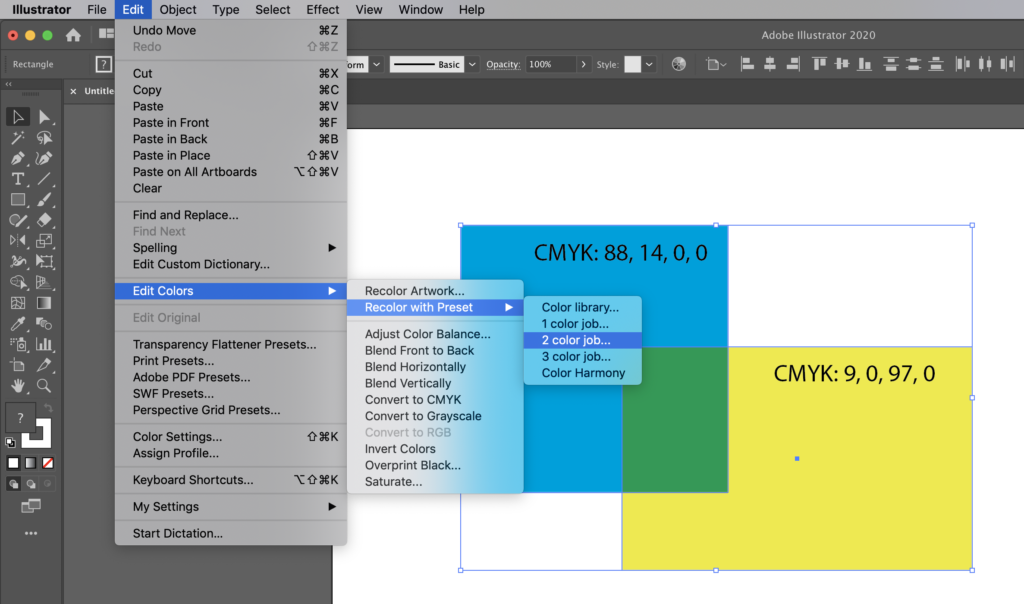
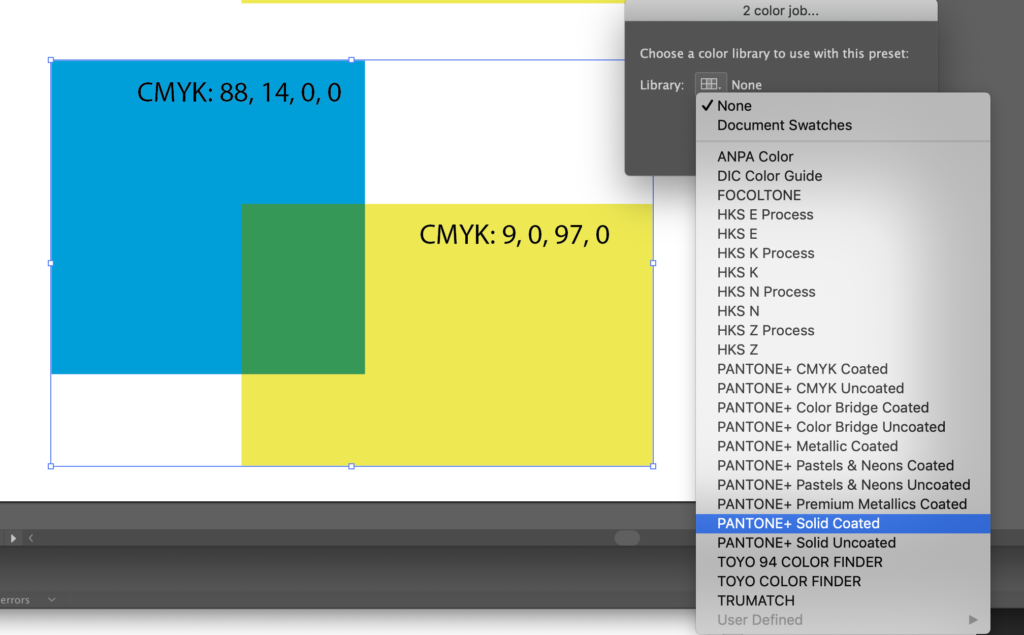
With Adobe Illustrator, select a color space from the Libraries menu.
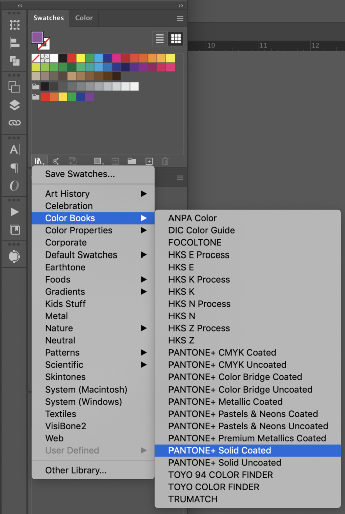
Incorporating spot color for print in Adobe Photoshop is a little clunky, but it can be done. It’s better to create your artwork in Illustrator or InDesign for cleaner color separations, but if it needs to be done in Photoshop, here’s how:
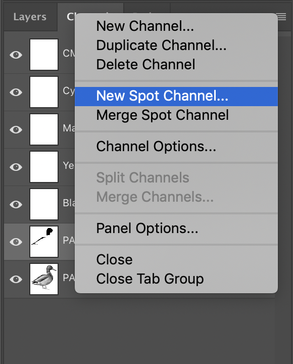
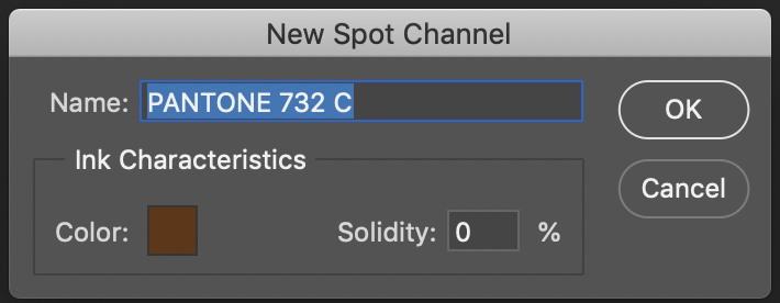
If you use Photoshop to create a spot channel, that spot channel exists in addition to the regular layers and channels in your file. This can make working with spot channels in Photoshop tricky—they don’t behave like an extra layer and don’t have all the blending options that layers do. If you need to incorporate a spot color that includes blending, masks, or any other layer features, it may be best to prepare a layer, then copy-and-paste that layer artwork to a spot channel at the very end.
Common issues designing with spot colors
It’s important for graphic designers to know how spot colors will be used. Graphic designers often create brand guidelines to accompany corporate logos, and specify not only which spot colors should be used, but the closest CMYK and RGB equivalents for 4-color print and web.

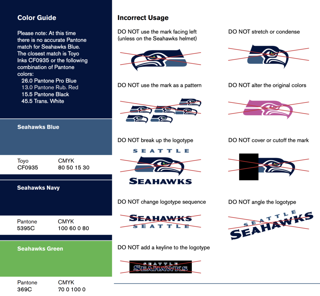
From washington.edu
From lionelmaltese.fr
For the novice graphic designer, it’s easy to use color pickers in the suite of Adobe products without verifying them in an actual swatch book. Adobe has built in Pantone swatches (among others) to easily pick spot colors from a menu. Adobe Illustrator, in particular, can easily convert CMYK or RGB colors to their closest spot equivalents. When designing a logo for print, a designer might start with an RGB logo for web use, then find the closest equivalent spot colors. This conversion, however, is based on Adobe algorithms which preserve the closest hue, luminosity, and saturation values for any particular color—it doesn’t guarantee that the spot color will be an exact match to the RGB color the designer sees on their screen. The converted spot color may be mathematically closest to the original RGB color, but that doesn’t mean it will look the same to a human eye.
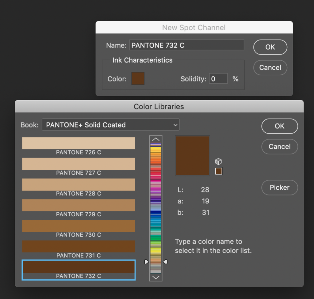
The best way to pick a Pantone spot color is to get a Pantone guide and select a color from the printed swatches. Make sure you’re picking it out of the book that matches the stock on which the job will print (coated or uncoated). Do not trust that what you see on a computer screen will be an exact match to the color when it prints.
The difference between “C” colors and “U” colors
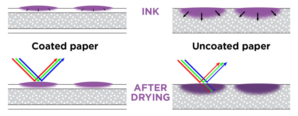
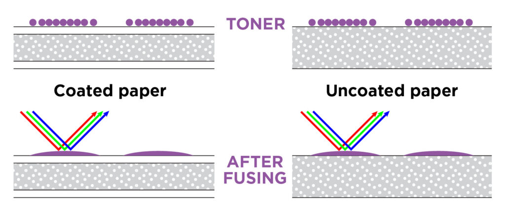
When ink is printed on paper, coated stocks—paper that has been treated with a clay or other mineral preparation to create a gloss or semi-gloss surface— do not absorb as much ink as uncoated stocks do. More light reflects off the surface of the sheet, and we see slightly brighter, more saturated colors. Because of this, Pantone® produces two guides using the same inks on coated and uncoated stocks.
Both of these subsets—“C” colors for coated and “U” colors for uncoated—are embedded in most modern graphic design software. Selecting 395C or 395U in a computer program is only simulating the ways 395 might print on coated (“C”) or uncoated (“U”) stocks.
It’s important to know before printing what look you’re trying to achieve. Uncoated stocks will have a flat finish and slightly muted colors. Coated stocks will have anything ranging from a light sheen to a full gloss and more vibrant colors. Textured stocks are almost always uncoated.
Digital printing
To further complicate matters, most high-end digital laser presses incorporate Pantone colors in their print engines. The software that drives the digital press contains a database of spot colors and the CMYK values that will most closely replicate each color with CMYK toner. Because toner sits on top of the sheet and doesn’t soak in at all, it can replicate colors that are brighter and more vibrant, even on uncoated stock. So if a file is built with a “C” color and printed digitally, the color will look brighter than if it were printed offset.
For a more in-depth look at offset vs. digital printing, click here.
Sometimes customers prefer the brighter “C” color but still want uncoated stock. And if the job is ever only intended to print digitally, that’s fine! But it it’s ever going to print offset, the offset color won’t match the digital “C” color. The printer would need to convert to “U” colors for a more accurate digital proof. Better yet, the designer should use “U” colors to begin with, as it will help create more consistent branding across a variety of media.
A quick note about HEX codes:
It’s common to see HEX codes in brand guidelines (“4b2e83” is the UW purple from the example above). While it’s called a “code” and seems like it should be a definitive recipe for consistent color, it’s not.
HEX is short for hexadecimal, and it’s simply computer shorthand for RGB colors (you can read about RGB vs. CMYK in more detail here). It’s most commonly found in HTML for building a website, which is a common element in a brand identity these days. It does not easily translate to printed color, and it’s not the same thing as a Pantone number.
Best practices for choosing spot colors
When designing with spot color, it’s always best to select your color directly from a swatch book. Don’t trust that the printed color will match what you see on your computer screen.
It’s also good to stick to simpler Pantone colors. Pantone base inks are common across many printing industries, including flexographic (for labels or plastic bags), pad printing (for imprinting 3d objects like pens or coffee mugs), and screen printing (for T-shirts or other textiles). If you want the logo on your T-shirt to match the one on your coffee mug & business card, it’s a good idea to stay close to the base colors.
Here’s a loose guide to Pantone numbers:
| Pantone Number | type of ink | ease of mixing/printing | likely to match expectations? | Additional recommendations |
|---|---|---|---|---|
| starts with “0” or has a name | base color | very easy (ink comes straight out of a can) | very likely | Base colors are strong & vibrant, common to multiple industries (T-shirts, textiles, etc.) |
| 3 digits, 100-399 | classic color | easy | likely | Vibrant colors for coated or uncoated stocks. 2 base colors, simple ratio, maybe tinted with white or shaded with black. |
| 3 digits, 400-599 | greys, shades | tricky (blend of complementary base colors: red-green, blue-orange) | recommend a press check or sample to match | Greys are notoriously difficult to mix and print consistently. We usually want the customer’s own eyes double-checking these. |
| 3 digits, 600-799 | muted tones | difficult (higher percentage of white or black) | okay, but gets expensive | Tiny amount of pigment in a large amount of white or black; usually have to mix several pounds of ink to get the right ratio. |
| 3 digits, 801-807 | fluorescents | very easy (straight out of a can) | likely if you know what you’re asking for | Impossible to proof on a computer screen. They do not convert to CMYK. |
| 3 digits, 808-814 | blended fluorescents | easy (basic ratios) | unlikely | Not as bright as unblended fluorescents. Strongly recommend testing a swatch on the same stock you plan to use. |
| 3 digits, 871-877 | metallics | easy | likely if you know what you’re asking for | Metallic colors are very consistent if you know what you’re getting. Difficult to proof on a screen, they do not look the same converted to CMYK. |
In addition to the chart above, Pantone has interspersed 4-digit numbers. If they end in a 5, it’s usually to achieve some consistency between coated & uncoated stocks (as evidenced by the 299C/2995U example above). As a general rule, 4-digit Pantone colors are harder to blend, as the ratios are more precise. 4-digit numbers ending in anything other than 5 can be a headache for your printer—they usually involve 3–4 base colors blended precisely to create a complex and subtle hue, with white or black added—these can be hard to mix in small amounts consistently. If you need a 4-digit Pantone as a brand color that you plan to use repeatedly, your printer may recommend buying and storing several pounds of ink for future runs. 4-digit Pantone numbers 8000 and above are metallics combined with a color—you’ll definitely want to test the results if you venture into this territory.
The takeaway
The best results will always come from looking at a physical piece of paper with ink on it: a Pantone swatch is best. If the job is intended for uncoated stock, make sure you’re referring to an uncoated swatch book. And if you don’t own or can’t afford a swatch book (they’re expensive…), your printer should let you drop by for a visit and look at theirs. If you don’t have a swatch book or access to one, request a draw down—basically, this is ink on paper: a custom swatch for the ink you plan to use. It adds time and expense (usually 3-4 days and $30 per color) and you don’t have the luxury of flipping to another page in a swatch book to look at alternate colors, but it’s better than receiving a print job with a surprise color on it.
If you’re designing branding for both coated and uncoated stocks, it’s best to make two separate logos (or at least, specify two ink colors in a branding guide and make sure the printer knows which colors to use). Similar to the Pantone 395C/3965U example above, sometimes the best match for coated & uncoated stocks is two different ink colors—don’t assume that 395 will look the same on coated & uncoated stocks.
At Seattle Printworks, our aim is to produce work that meets or exceeds our customers’ expectations. Whenever we see “C” colors on a job for uncoated stock (or vice versa), it sends up a red flag for us to make sure the proof is accurate as possible. And it may involve changing stocks or selecting new colors for the job—which can sometimes delay a job a day or two while we iron out any inconsistencies between the file and the proof. Knowing the difference between “C” and “U” spot colors and how they’re used will give you the most control over your print job, minimize the amount of time needed for prepress and proofing, and insure it prints accurately and quickly.